
TL;DR:
- Choosing the wrong color can shrink the space and create an unsuitable ambiance, impacting well-being. Color psychology guides these choices based on lighting, size, and the desired retro style for a harmonious and dynamic living room.
Choosing the wrong color for your living room is one of the most costly decorating mistakes, yet it's also the most common. The impact of color in the living room goes far beyond aesthetics: a poorly chosen shade can visually shrink the space, strain your eyes in the evening, or create an ambiance that doesn't align with your lifestyle. This guide is designed to give you a solid foundation in color psychology, show you how to adapt your choices to the light and available space, and help you create a retro living room that truly reflects you.
Table of Contents
- The psychological and visual impact of colors in the living room
- Adapting color choices to the lighting and size of the living room
- The 60-30-10 rule and how to apply a trendy retro palette
- Integrating color with online retro furniture for a young adult living room
- Tips and mistakes to avoid for a harmonious and practical colorful living room
- Why retro design and color psychology will revolutionize your living room
- Discover the collection of retro and practical sofas at Joya Home
- Frequently asked questions about the impact of color in the living room
The psychological and visual impact of colors in the living room
Color psychology is not a discipline reserved for professional designers. It's a concrete tool you can use today to set the mood in your living room. Warm and cool colors affect the brain differently, and understanding this difference changes everything.
Warm hues like red, orange, and mustard yellow are physically stimulating: they increase heart rate by 10 to 20%, making them perfect for a living room where you entertain friends. Conversely, soft blues, greens, and purples reduce anxiety by almost 25%, creating soothing colors for a living room where you unwind after work.
Here's what each color family concretely brings:
- Red and orange: energy, conviviality, conversation stimulation
- Soft yellow and ochre: luminous warmth, optimism, sense of well-being
- Olive green and sage: connection to nature, calm, balance
- Teal and indigo: deep relaxation, concentration, elegance
- Terracotta and brick: grounding, authenticity, visual comfort
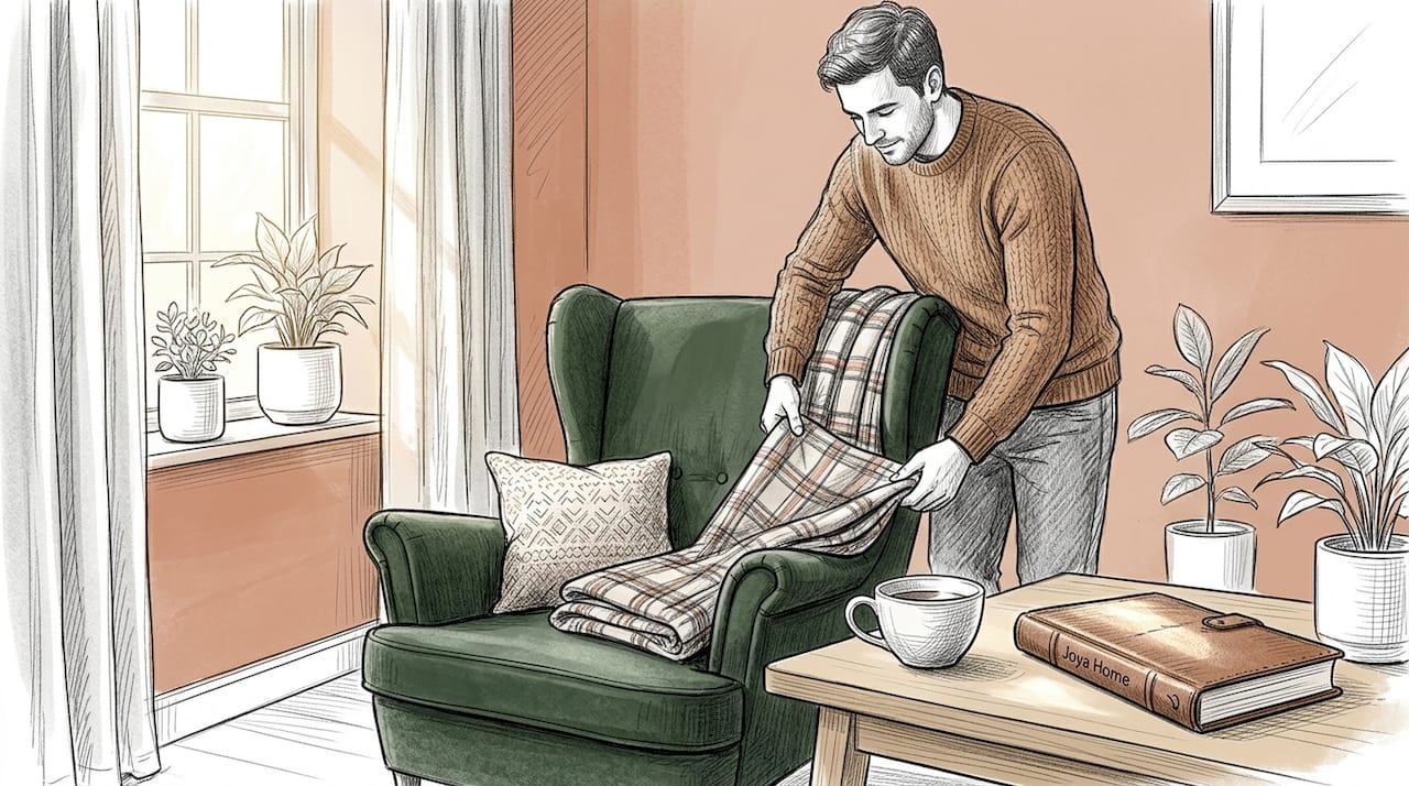
For a successful retro living room, optimized cozy living room styles show how these earthy tones create immediate warmth without overwhelming the space. The effect of decorative colors is powerful and measurable. Don't leave it to chance.
Adapting color choices to the lighting and size of the living room
The classic mistake is to choose a color on a screen or in a store, then find it completely different on your walls. Light transforms everything. A north orientation bathes your living room in cold, bluish light all day. A south orientation floods the space with intense light that saturates colors.
According to professional industry rules, orienting your choices according to exposure is fundamental: in the north, opt for soft ochres or milky camel to compensate for the cold light, while in the south, pearl gray or teal temper the light intensity.
The size of the living room also plays a decisive role:
- Small living room: light colors (off-white, sand beige, pale green) to visually enlarge the space
- Large living room: dark colors on an accent wall (midnight blue, forest green, intense terracotta) to create intimacy
- Living room without windows: never dark cool colors, always warm and bright hues
| Living Room Type | Recommended Color | Visual Effect |
|---|---|---|
| Small and dimly lit | Off-white, pale ochre | Enlargement, lightness |
| Large and bright | Terracotta, teal | Intimacy, character |
| North-facing | Milky camel, soft ochre | Compensation for cold light |
| South-facing | Pearl gray, olive green | Absorption of intense light |
Pro tip: Print or buy large paint samples (at least 30x30 cm) and place them on different walls in the living room for 24 hours. Observe them in the morning, midday, and evening with artificial light on. This simple step avoids most regrets. For small spaces, consult our guide on optimized small living room design to go even further.
The 60-30-10 rule and how to apply a trendy retro palette
The 60-30-10 rule is probably the most useful framework a non-professional can adopt. It applies to any living room, but it takes on a particular dimension in a retro interior where colors are strong and personal.
In 2026, this rule remains the benchmark: 60% dominant color, 30% secondary, 10% accent for balanced visual harmony. Here's how to apply it concretely:
- 60%: the dominant color covers your main walls and large furniture. Choose a neutral but warm shade, such as pale ochre, sand beige, or off-white.
- 30%: the secondary color brings personality. This is your olive green velvet sofa, your terracotta curtains, or your mustard accent wall.
- 10%: accents punctuate the whole with small touches. Cushions, vases, lamps, frames, antique objects. This is where you can dare with brick red or copper.
For retro palettes, 70s vintage trends remain dominant in 2026: terracotta, burnt ochre, olive green, mustard, and brick. These earthy tones work together naturally because they share the same warm temperature.
Pro tip: Strictly limit yourself to three colors in your palette. Four maximum if you incorporate a metal like copper or brass. Beyond that, the living room becomes visually exhausting, regardless of the quality of the chosen shades. The 3-2-1 method applied to sofas follows this logic exactly for a professional result.

Integrating color with online retro furniture for a young adult living room
Furniture is the element that anchors your palette in reality. And in a retro style, three materials dominate: natural wood, woven rattan, and corduroy. Each reacts differently to color and light.
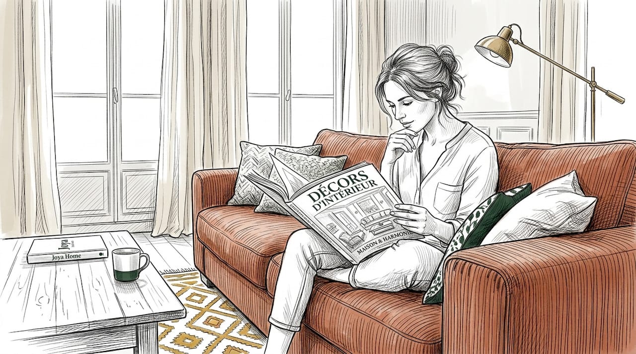
According to current decor trends, combining terracotta and rattan creates immediate natural harmony, while olive green or mustard for furniture perfectly complements earthy palettes. Corduroy, on the other hand, captures and diffuses artificial light differently depending on the angle, visually enriching any shade.
A few rules to keep in mind for your online purchases:
- Always request a fabric swatch before confirming an order: colors on screen often deviate by 10 to 15% from reality
- Choose artificial light at 2700-3000K (warm white) to enhance velvet and earthy tones
- Harmonize natural wood tones with the warmth of your walls: light wood for ochres, dark wood for intense terracotta
- Plan your accessories before ordering the main furniture to avoid color incompatibilities
Pro tip: Take a photo of your walls with your phone, then compare this photo with the product visuals online. Even if imperfect, this quick method significantly reduces unpleasant surprises. Explore our online sofas to see available corduroy shades suitable for retro palettes.
Tips and mistakes to avoid for a harmonious and practical colorful living room
Knowing the theory is not enough. The most common mistakes do not come from a lack of taste, but from a lack of method. Here's what makes the difference between a disappointing result and a living room you love to live in.
Testing colors for 24 hours on sample boards placed on the floor avoids 80% of regrets after painting. This is the number one advice from industry professionals, and it is also the most often ignored by hurried individuals.
Mistakes never to make:
- Painting all walls in dark colors in a small living room: the space immediately becomes oppressive
- Mixing more than three main colors without expertise: the result is visually chaotic
- Ignoring the paint finish: a matte finish absorbs light, a satin finish reflects it, which completely changes the perception of the hue
- Choosing a cool color for a poorly lit space: this accentuates the feeling of humidity and cold
- Exceeding 10% vivid accents: two or three colorful objects are enough; beyond that, visual fatigue sets in
Pro tip: Opt for washable paints for all your colored surfaces. They clean without damaging the shade and last twice as long on frequently touched walls. This is a practical detail that changes the lifespan of your decor. To go further in optimization, our guide on optimizing small living rooms with color offers concrete solutions.
Why retro design and color psychology will revolutionize your living room
Here's a statement that needs to be said clearly: the return of retro colors is not nostalgia. It's a direct response to the visual void created by years of beige, white, and gray decor. And young adults understood this before anyone else.
Bright colors in living spaces boost creativity and productivity by 17%. This figure partly explains why earthy retro tones are making a strong comeback in 2026. It's not an aesthetic whim. It's a well-being choice.
What is not said enough is that retro and functional modernity are not opposed. A trendy 2026 corduroy sofa in olive green against an ochre wall is both a strong aesthetic decision and a psychologically coherent choice. The warmth of earthy tones creates an environment where one feels energized during the day and soothed in the evening, depending on the lighting used.
Daring to use these well-thought-out colors is also asserting your personality in a space that truly reflects you. Monotonous beige protects nothing; it simply erases. A well-designed retro living room, on the other hand, becomes a true "cocoon" that supports both creativity and rest. And that's something no minimalist trend can offer you.
Discover the collection of retro and practical sofas at Joya Home
You now have all the keys to choosing your colors with intention and building a retro living room that suits you. The next step is the furniture that anchors this palette in the reality of your daily life.
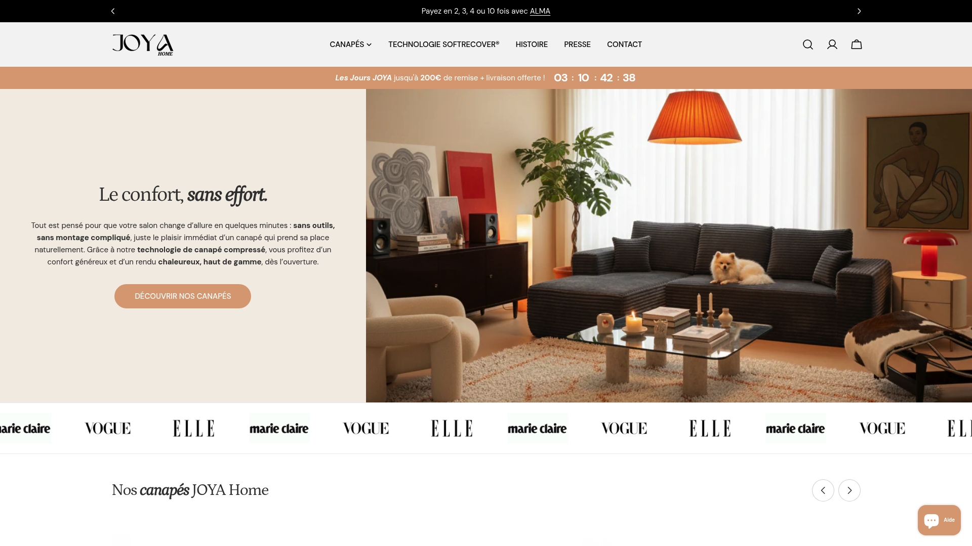
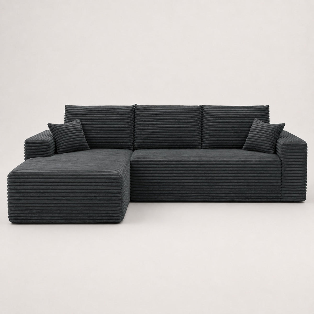
At Joya Home, our designer and comfortable corduroy sofas are designed to blend naturally into earthy palettes, with shades like olive green, mustard, and caramel brown. Compression technology allows for delivery in 7 days directly to your home, without logistical stress. We also offer models specifically designed for small spaces with quick assembly, ideal for young adults setting up their first living room. Discover the entire collection on our Joya Home retro sofas page and find the centerpiece of your future living room.
Frequently asked questions about the impact of color in the living room
How to choose the right living room color according to the light?
Analyze the orientation of your room: warm tones compensate for the cold light of a north-facing living room with soft ochres or milky camel, while cool tones like pearl gray or teal temper the intensity of a south-facing living room.
What are common mistakes to avoid when choosing colors?
Never paint without testing on the floor for 24 hours, as this step avoids 80% of post-painting regrets. Also, avoid exceeding three main colors and ignoring the effect of natural light at different times of the day.
How to integrate a retro style with colors in a modern living room?
Apply the 60-30-10 rule with a warm palette: ochre or off-white as dominant, terracotta or olive green as secondary. 70s retro palettes like ochre and terracotta are particularly suitable for young adults wanting a warm and personal interior.
What is the impact of colors on well-being in a living room?
Warm colors stimulate energy and conviviality, while cool tones reduce anxiety by 25%, making them a direct lever on your daily quality of life at home.